
Social Bookmarking List
Earlier this year, a presentation made by Jensen Harris, Director of Program Management for the Windows User Experience Team, gave a rare glimpse into how Windows 8 looked and worked before Microsoft went public with the operating system.
 In the presentation,first noted by blogger Long Zheng,
Harris talks about how Windows 8's user interface came to be. His
central thesis is that familiar interfaces can be displaced by new
interfaces that are built for the present rather than the past. The
graphical Windows displaced the text-mode DOS; Windows 95's easy
multitaksing replaced Windows 3.1.
In the presentation,first noted by blogger Long Zheng,
Harris talks about how Windows 8's user interface came to be. His
central thesis is that familiar interfaces can be displaced by new
interfaces that are built for the present rather than the past. The
graphical Windows displaced the text-mode DOS; Windows 95's easy
multitaksing replaced Windows 3.1.

What modern change justifies Windows 8's abandonment of familiarity? New form factors, new modes of interaction, and the pervasive use of the Internet. Though they didn't ship until 1995, the basics of the Windows taskbar and Start menu interface were designed in 1992, in an era before widespread Internet usage when Office and document editing were king.
In the 20 years since, the Internet has become a part of everyday life. Documents are still important but they're no longer central; computers, tablets, and smartphones have replaced phone calls, phone books, road maps, CD collections, photo albums, books, and more. Mouse and keyboard haven't been replaced but they've been joined by touch. Harris argues that these changes motivate a new interface.

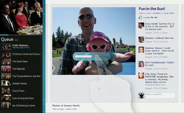
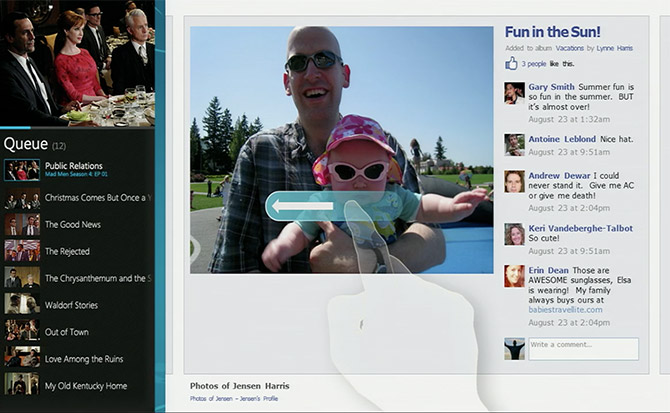
Harris showed some early versions of the Windows 8 interface from 2010 in his presentation. Even then, the core elements were all in place; the Start screen packed with Live Tiles, the snapped side-by-side multitasking, and the charms that swiped in from the edge. This first iteration was more complex than the final product, as the early Start screen included a persistent clock, date, Wi-Fi signal meter, and battery meter. Those things are now only visible when the charms are on-screen—and those charms originally numbered eight instead of the five we have today.
The presentation also gives some insight into some of broader design themes, in particular, "doing more with less;" stripping back unnecessary or irrelevant features of the operating system. Harris cites as an example the warning Windows gives when your battery is low. In Windows 7, this dialog warns you that the system will hibernate and that you need to plug your computer in or "find an alternate source of power," as if you could invent cold fusion or something to keep the system running. In Windows 8, the message simply tells you to plug your computer in again.
What's striking about the presentation is that they reveal that genuine thought that has gone into the Windows 8 design, from ensuring certain pieces of the Start screen line up when swiping through to guaranteeing that the kerning of the "Start" text on the Start screen is always right. Harris acknowledges that many of these things might go unnoticed but argues that "God can see" the details.
This is eye-opening, because so much of Windows 8 lacks this same attention to detail. Windows 8 is really two user interfaces crudely grafted together.And parts of Windows 8 have had this attention lavished on them which makes the contrast with the other, older parts of the operating system even more stark.

/ The early keyboard had more shading than the final model and lacked some of the conveniences like arrow keys./
Earlier this year, a presentation made by Jensen Harris, Director of Program Management for the Windows User Experience Team, gave a rare glimpse into how Windows 8 looked and worked before Microsoft went public with the operating system.


What modern change justifies Windows 8's abandonment of familiarity? New form factors, new modes of interaction, and the pervasive use of the Internet. Though they didn't ship until 1995, the basics of the Windows taskbar and Start menu interface were designed in 1992, in an era before widespread Internet usage when Office and document editing were king.
In the 20 years since, the Internet has become a part of everyday life. Documents are still important but they're no longer central; computers, tablets, and smartphones have replaced phone calls, phone books, road maps, CD collections, photo albums, books, and more. Mouse and keyboard haven't been replaced but they've been joined by touch. Harris argues that these changes motivate a new interface.

Harris showed some early versions of the Windows 8 interface from 2010 in his presentation. Even then, the core elements were all in place; the Start screen packed with Live Tiles, the snapped side-by-side multitasking, and the charms that swiped in from the edge. This first iteration was more complex than the final product, as the early Start screen included a persistent clock, date, Wi-Fi signal meter, and battery meter. Those things are now only visible when the charms are on-screen—and those charms originally numbered eight instead of the five we have today.
The presentation also gives some insight into some of broader design themes, in particular, "doing more with less;" stripping back unnecessary or irrelevant features of the operating system. Harris cites as an example the warning Windows gives when your battery is low. In Windows 7, this dialog warns you that the system will hibernate and that you need to plug your computer in or "find an alternate source of power," as if you could invent cold fusion or something to keep the system running. In Windows 8, the message simply tells you to plug your computer in again.
What's striking about the presentation is that they reveal that genuine thought that has gone into the Windows 8 design, from ensuring certain pieces of the Start screen line up when swiping through to guaranteeing that the kerning of the "Start" text on the Start screen is always right. Harris acknowledges that many of these things might go unnoticed but argues that "God can see" the details.
This is eye-opening, because so much of Windows 8 lacks this same attention to detail. Windows 8 is really two user interfaces crudely grafted together.And parts of Windows 8 have had this attention lavished on them which makes the contrast with the other, older parts of the operating system even more stark.

/ The early keyboard had more shading than the final model and lacked some of the conveniences like arrow keys./
Written by Arslan Asif
We are Creative Blogger Theme Wavers which provides user friendly, effective and easy to use themes. Each support has free and providing HD support screen casting.


0 comments:
Post a Comment